
Thursday, January 23, 2014
GDP & Energy - 2 sides Of The Same Coin - But What Was The 20thC's Turning Point In 1950?
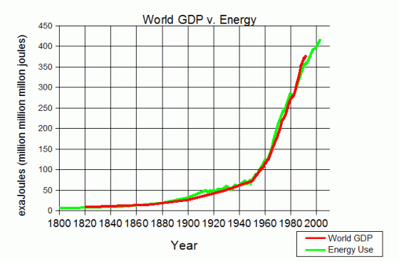
Some time ago I published this graph as part of an article and series of graphs from Mike Haseler.
However it is so beautiful that it deserves a post devoted to it alone,
When he gave his talk he explained how the initial figures, which had included only officially produced figures had come to a less satisfactory result - then he added cooking fires across the world and it all fitted into place. That sort of elegance emerging from chaos does tend to mean something profound (E=MC^2 being an example).
You just don't get data correlations as close as this if you are measuring different things. Thus energy use and wealth simply are the same things.
This is a world figure - the correlation is less close nationally/ Partly because it is colder in Canada than Equador. partly because the local energy availability (usually oil or hydro power both of which Canada have) varies. However this also shows that where one country prevents people using energy the effect is to move the industry elsewhere in the world.
I also find the slight variations from perfection of the curve fascinating:
1 - From about 1890-1930 energy use slightly leads growth. That era up till WW1 is indeed often held up as the era when most technological change in people's lives occurred. Also fascinating that WW1, the depression and WW2, all of which are treated as massive changes, usually for the worst, simply do not register on either energy or wealth.
2 - Then just before 1950 we get a significant increase in the rate of growth of both. It isn't an immediate post war boom - a few years late for that. Nor the production of commercial nuclear power - to early for that. Conceivably it is the cold war turning hot in Korea leading the US to encourage the reindustrialisation of Japan but that seems to minor. Whatever it is in economic terms this is the most important literal economic turning point of the 20thC.
3 - Which in turn shows how the graph is close to but not exactly a classic S curve:

If there had not been the 1950 turn it would be a perfect fit for an S curve which would suggest we still have quite a way to go before hitting the top - anywhere between another 30 years and forever before we hit top. And though it isn't a perfect S curve it is as close as real economics is going to produce, so that conclusion is still very reasonable.
4 - Around 1962 we get another minor acceleration. Possibly this is nuclear coming on line. possibly not.
5 - From 1962 to 1980 we also see energy use slightly leading wealth growth. I'd be fairly confident in putting that down to nuclear (the anti-nuclear movement became effective about 1970 but because of the lead time in building plants this only means that plants would only stop coming online about 1980.
Note that when it comes to cause and effect, causes must always lead effect. Thus the growth in energy in the 1890-1930 & 1962-80 period can only be a cause not an effect of wealth increase.
6 - After the mid 1980s it switches over. Wealth growth continues at the same rate as from 1962 (possibly even marginally faster between 1982-4) whereas growth in world energy use starts to lag it significantly. That does look entirely like the effect of the Luddite movement. It has certainly had an enormous effect across the western world, where most of the Luddism is, and if it were to start affecting China etc., could then have a serious effect on the wealth of the entire human race.
---------------------
My feeling is that, unless we embrace Luddism, the start of topping of the S curve for world energy use/gdp will be at least as far ahead as 1950 was behind. Moreover by then there will be 2 graphs - World GDP/Energy and Human GDP/Energy. By 2078 a lot, perhaps most human energy use will be in the off planet economy, and that it will be increasing at an even faster rate, around twice as fast, as terrestrial energy use has increased for since 1950.
Up till we start using anti-matter to power interstellar craft - which will need at least an order of magnitude more energy again.
Labels: Cheap Energy, economics, Science/technology
Comments:
<< Home
I have to admit that the graph was done an awfully long time ago and as I recall I sent it to Margaret Thatcher as part of a report - but I cannot remember the precise reason I did it.
Your point about the lack of much sign of the world wars is interesting. What this tells us is that within the available energy budget, people chose economic "activity" which was war. So this was a displacement of economic activity (and some sharks got really rich from the wars).
However, as you say there is a distinctive change in gradient around 1950.
If the enerconic theory is correct, this implies that a new source of energy became available - or a production means vastly increased the amount of energy per unit of energy used to gain it.
So, in the same way wind has vastly decreased the output energy per unit of energy spend getting it, so it would appear the reverse happened around 1950.

Thank I didn't realise the antiquity of it. That explains why the GDP figure ends about 1990.
If you have any more such hidden gems (I am entirely serious about the term) I hope you will make them public on your Scottish Sceptic site or elsewhere.
Perhaps in 1950 there was some breakthrough that allowed coal or gas plants to be more efficient or built more cheaply? Or did oil use start its growth then? I don't know but appreciate that this gives somewhere to look. I don't think nuclear was big enough in 1950 to make the change but by 1980 it was around 20% of world electricity, from which it has fallen a bit due to Luddism.
Possibly from ~ 1949 to 1968 the postwar capital controls were relaxed enough to allow people to transact for what they needed without too much interference in an extraordinary financial environment in which the USA was essentially bleeding its huge stock of postwar gold in order to finance the struggle against Communism. Since intergov gold transfers were affected starting 1968 and stopped in 1971 the engines of this possible means of ascent were cut off yet the climb clearly continued for a bit because the real economic wealth generated made its own market-- yet the 1973 and 79 oil shocks plainly affect the upward trajectory. This may be one piece of the puzzle-- others?
Post a Comment
<< Home
![]()